conjuration

352mc

In Conjurations Films Clare Strand shows a series of improbable events young women rotating their heads or pulling a piece of ‘brain floss’ right through them,

or pulling endless streamers or eggs from their mouths. All the scenes are 
obviously impossible but what’s less obvious is how they have been faked –common sense dictates they’re tricks, but the films retain their air of innocence. 
Photographs and films, so often used as evidence, can be convincing falsifications 
because of it.
Girl_in_Two_Halves_SMALL Small_JPEG_47 Small_JPEG_48
In this works Strand pulls the extraordinary out of ordinary places/ scenarios in her conceptual portraiture, something I resonate with, as I am using these techniques in my project.

352mc End Of Module Reflective Report.

352mc

In completing this module, I embarked on my final idea towards the later months. The earlier work focused on the process rather than the content and lacked development at this stage. I decided to change my project, commencing with research into an underlying issue and theme to ground my work before brainstorming ideas for my imagery. Recognising that I needed to be more efficient with my time management, I learned how to manage a project of this scale, this being the first large series project I have undertaken. The pressure and limited time available at the end of the project made me more efficient, allowing myself to be completely absorbed in the project, producing a great amount of work in a very short period of time.

In hindsight, the earlier project was still a valuable process as it strengthened my skills in working with movement and constructing eye-catching imagery. Without the experimentation from the first project, I wouldn’t have been able to produce the final body of work to such a high standard. However, if I had approached the project from a more conceptual basis earlier on, I would have had more time to expand the body of work.

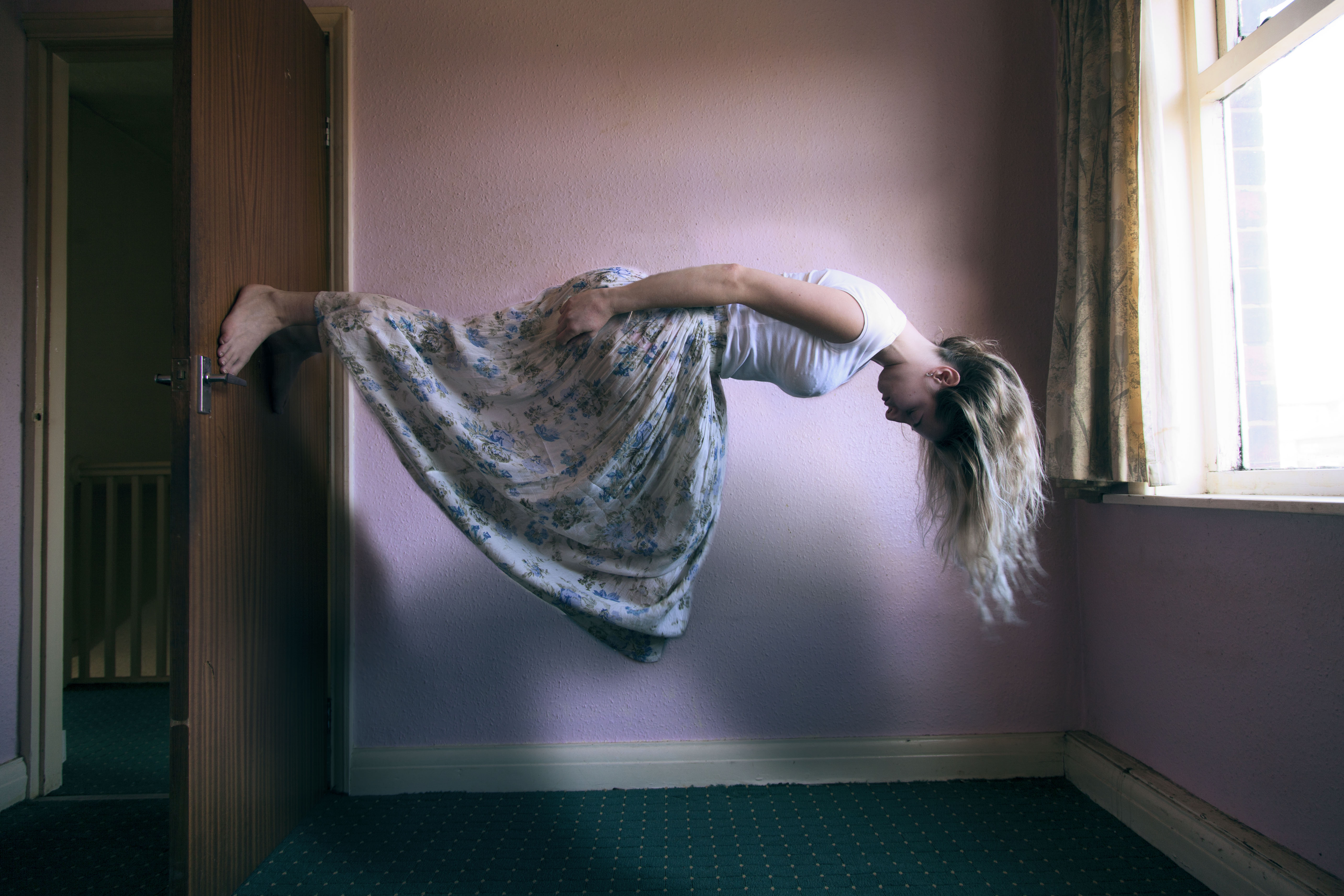
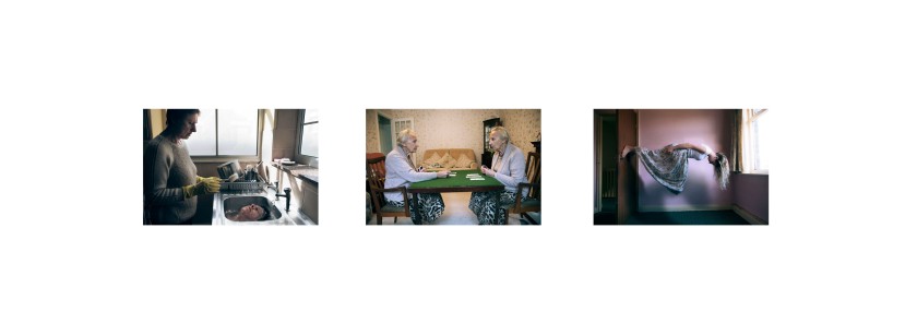
I gathered research from the medical illness: Dissociative Identity Disorder, in which a sufferer experiences one or more split personalities taking control over the self. I decided to make a response to the symptoms, using them as a starting point for the imagery. Whilst this is the starting point for the surrealist theme, the work solely intends to act as a suggestion for a dissociative disorder, or an alter ego, and not imply that the work should solely be viewed this way. In this way, the work allows the viewer space for their own interpretation.

Research into surrealism was a key element within the development of my work. The surrealist movement believes in unlocking the power of the imagination, accessing the mind’s subconscious and discovering revelations in everyday life.

The research gave me an insight into a fantasy world of dreams and paranormal happenings, sparking inspiration and ideas for the project. I commenced the production with images of reality, and added in surreal elements of myths and dreams stemming from the subconscious. Surrealist artists such as Max Ernst and Salvador Dalí inspired my work with their production of images of extraordinary happenings in the most ordinary of places.

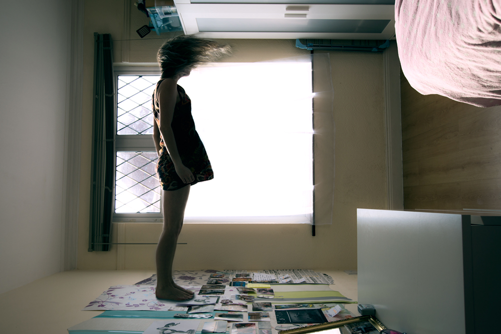
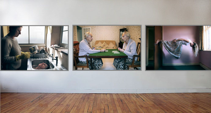
The final images are a type of hybrid with elements of editorial/fashion and fine art within the portraiture. At first glance, the image of the girl set in the bathroom with the elaborate facial expressions and the glossy surreal pigmenting of the colours could be something seen in an editorial campaign. The series also displays elements of conceptual fine art. Amongst the moments of trickery and surprise, the narrative of the images is not prescribed, allowing for the viewer to ponder upon the images, to search for the meaning piecing the images together, and to decide for themselves the context from which they derived.

The first few images that I created were not included in my final five prints. During my experimentation at the early stages, it became clear to me that the more subtle images combining reality with hyper-reality and the illusive elements of surprise were more successful.

I see my audience being individuals of all ages, genders and class, whether interested in art or not. I feel that each person could have a different image which most resonates with them, potentially experiencing feelings of discomfort and unease with the upheaval of inner personal memories and feelings.

The work may be suited in contemporary art galleries such as ‘The Photographers Gallery’ and ‘The Tate Modern’ in London. The work could exist in a group exhibition alongside other art of a conceptual and surreal theme, or a lager body of work would stand strong as an individual exhibition.

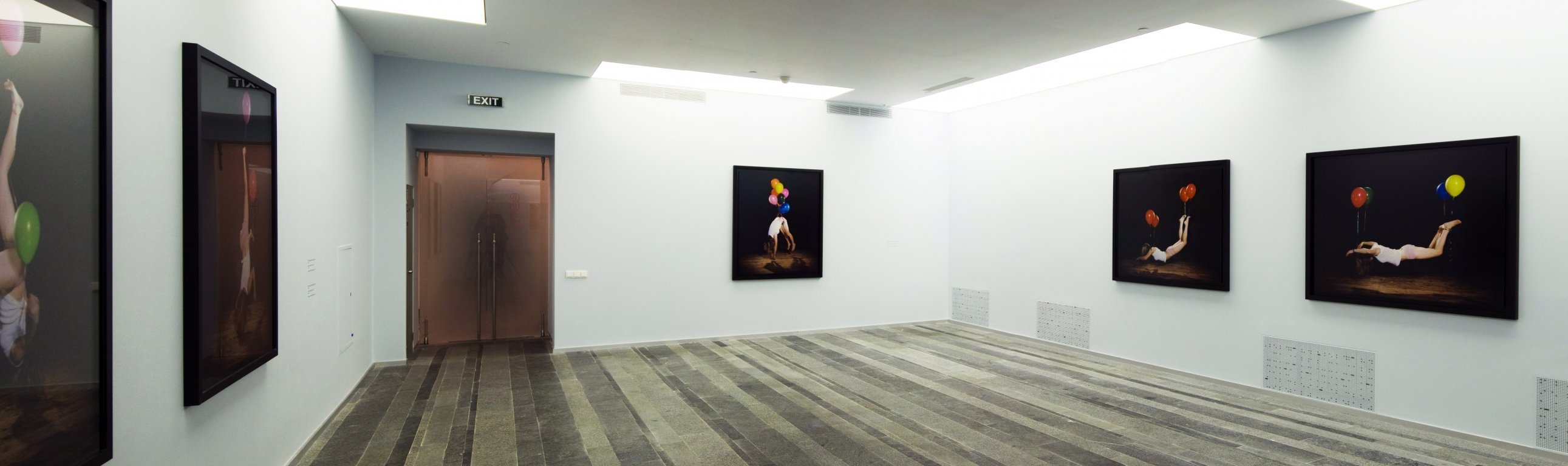
If I were to exhibit in my own gallery with unlimited space, each print would stand alone, scaled to a width of three metres by two metres in height. Inclusion of vast white spaces would allow for breaks between images, immersing the audience into the imagery.

I will be continuing to work on this project, expanding the body of work, strengthening my methods and skills, improving and defining the imagery and identifying its place in the photo world, exiting the course at Coventry University with a substantial professional body of work to represent myself as a unique practitioner.

Layout Tests.

352mc

At the moment I am still deciding which images to display, which sizes and layout.

I am playing around with sizing and layout of the images I think compliment each other.

After tutorials with Emma Critchley and David Rule, they advised that the images could all go together, but they could also be divided to work in two sets.

One set being the more subtle images, with the reality and surreality being closely linked, in a more domestic setting.

Here I tested how they would work together.

layout test 3

Another set that may go together are the more dramatic ones. Where the content couldn’t possibly be real. These images are almost cartoon like and surreal, but I think they work well together. The colours are brighter than the other set, less moody and pensive, but lighter and more playful.

layout test 2

Or I could combine the two sets, trying out a different layout.

layout 5 images

I like this layout here, but I don’t know if it’ll work on a wall, whether it will compliment my images, or to make the prints huge and immersive and intimate.

blank-wall white

blank-wall silver Exhibition setup

here are a few tests of how it might look in an exhibition space. The images don’t contain much black, so I don’t think the black frames compliment them so I will be thinking about either silver metal frames or white.

I have tested with 5 smaller prints too.

Layout 5

5 layout

I think it works well with the strongest images in the middle.

I will be purchasing 5 50cm x 70cm frames with a small silver aluminum framing.

As the work is a series, I decided on displaying five images instead of three as I feel it fits better to display a series rather than a taster or an introduction. After receiving other opinions on which to display, I chose to print the images shown in the last layout as they are the stronger images in the set, and all compliment each other well.

Framing Ideas

352mc

Testing frame ideas…

Without a frame

layout test 3Thin black frames

I’m liking the simplicity of the thin black frame, with the print filling the whole frame. Thin Black Frames

Silver Aluminium Frame

I do like this one, but I think black may compliment the prints better. But I think it looks very clean and professional and the least distracting.

Silver frame

Thick black border.

The thick border doesn’t work with my images, it’s too smothering and distracting. Thick Black Frames

And then there is white frames. I don’t think there would be much point having a white framed print on a white wall, but heres an example on a cream wall. So I’m going to rule out the option of the white. White Frames

On the other hand, Tim walker uses white frames for his exhibitions and they work really well. His images contain a lot of colour, they are very editorial and fantasy and the white brings out the fantasy feel.

5 Tim-Walker_Somerset-House_10

Exhibition Strategies.

352mc

For presenting my images I am thinking about how I want them to be in the gallery. As my images are very detailed. I want something simple that will not detract from my work or the message, so I want display them in a traditional standard way and have them as prints on a wall. I want the audience to be drawn to my work and be immersed in it, so I am thinking of displaying it quite large. I will choose a few of the best work, and the ones which compliment each other, and follow the same type of theme.


I am looking at mounting and framing.

Ideas for framing:

20150117125051-20140908_054 DSC02704

Looking at the work of a photographer I like, Sam Taylor Wood to see how she exhibits her work.

I like this technique of having the images stand within a frame, with a small border, with the image slightly raised from the back of the frame. It looks stylish, simple and makes the work the main focus.

0785e9717d17d976a2cda42d673ad05782287941.589 sam-taylor-wood

I like how she plays around with different sizes and numbers, spacing her work strategically on the wall in these exhibitions. The images contain both equal amounts of darks/black and white, and the frames she chooses a simple black with a white border to compliment the imagery..

crying_men_taylor_wood_p2 saltz10-4-3

These are good examples of work on a large scale. I think they work well closer together when the images are simple and very similar colours, like the landscape photos, but i don’t think it would always work well for other works. I like the spaced out work, but I know this won’t be possible for the collective vision exhibition as the space is to incorporate work from all different photographers. It would work nicely if you had the whole room to exhibit one project. I also like this style of filling the whole frame, with the frame being very thin and in a neutral colour.

2_sam DIG_E2010_Sam_Taylor_Wood_01_PS4 Sam-Taylor-Wood_05-927x640

Another photographer I love the work of is Tim Walker.His style of Fashion photography is very surreal, with dramatic use of colours and bizarre scenarios making for very visually interesting work. Looking at work from some of his exhibitions, he tends to change his exhibiting strategy to suit his body of work and theme.

Storyteller-0835 Stylesight_Tim-Walker11

This sort of exhibition is super cool and unique, it adheres well to the unique style of Walker’s imagery with the inclusion of props with the images. I do like this way of presenting the work, but I feel it takes the attention off the imagery, this could be a good thing; taking the viewer into the world of Tim Walker and his weird and wonderful style, creating a viewing experience that is non linear and interactive. It could also be a disadvantage, taking the viewer away from the images, making the exhibition look a bit unorganised, like a that of a jumble sale, not making the main focus the strong powerful imagery.

I prefer the more symple layout of Walker’s work in the installation below. His work is beautiful and engaging and as a viewer of a photographic exhibition I’d like the main focus to be on the artist’ imagery.

Tim-Walker_Somerset-House_10

Walker still keeps some creative elements in this work, but they are cleverly integrated with the rest of the space, adding to the theme of the work, but allowing for breaks in between the images without the distraction of props.

Alter ego.

352mc

The next idea was inspired by the split personalities one suffers when battling Dissociative Identity Disorder, commonly known as the alter ego.

As according to Psychology today:

Dissociative Identity Disorder, formerly referred to as Multiple Personality Disorder, is a condition wherein a person’s identity is fragmented into two or more distinct personalities.

DID reflects a failure to integrate various aspects of identity, memory and consciousness in a single multidimensional self. Usually, a primary identity carries the individual’s given name and is passive, dependent, guilty and depressed. When in control, each personality state, or alter, may be experienced as if it has a distinct history, self-image and identity. The alters’ characteristics—including name, reported age and gender, vocabulary, general knowledge, and predominant mood—contrast with those of the primary identity. Certain circumstances or stressors can cause a particular alter to emerge. The various identities may deny knowledge of one another, be critical of one another or appear to be in open conflict.

Taking ideas from the primary identity within the Multiple Personality Disorder, I used this as a starting point with the primary character as the main focus, experimenting with the shifts in control of the self and the battles between the primary identity and the alters.

These images were inspired by the self denying the knowledge of the presence of the alter. I subtly placed a mirrored version of the self in the window of the house, so that the viewer has to search the image for the elements of surprise and trickery.

Alterego1 alterego2

Alter ego 3

This image I played around with the idea of the self battling the alter for the control over the personality. Representing this with a physical battle, implying the alter is leaving the house, taking place of the self in representing the person in daily life, wheras the primary identity has no control over the self once the alter is in control, metaphorically represented in locking the self away in the house.  alterego4

This image was inspired by the harmony or the game playing that may occur between the primary identity and the alter ego. Influenced by the two personalities playing against each other in the same game, or could represent the characters playing together harmoniously, these ideas I want the viewer to decide how the image makes them feel.

alterego5 alterego6

Although the research into the alter ego and Dissociative Identity Disorder are the underlying themes grounding my inspiration for this project, I only want to vaguely introduce and hint the stimulus and context to the audience. I don’t want my research and ideas behind the work to dictate how the viewer experiences the body of work. I want the final selection of images int he exhibition to be multidimensional, the context to each image dependent on each viewer’s opinion and feelings towards the work.

I will be titling the work ‘Misshaped Shadows.’ The idea stemming from a common, ordinary part of ourselves; a shadow. A shadow is not who we are, only a reflection. The ‘misshaped shadow’ comments on our imperfections as humans, being a part of us, but not defining our being.

Gestalt theory

352mc

Getstalt is a psychology term meaning, ‘unified whole’ referring to the visual perception theories founded by Germany in the 1920s. The theory explains how our minds organise and group certain shapes to create a unified whole. We visually are made to make order of chaos and connect disconnected bits of information.

Figure/Ground principle:

figureground

according to Facweb…

This principle shows our perceptual tendency to separate whole figures from their backgrounds based on one or more of a number of possible variables, such as contrast, color, size, etc.

A simple composition may have only one figure. In a complex composition there will be several things to notice. As we look from one to another they each become figure in turn.

The focus at any moment is the figure. Everything that is not figure is ground.

As our attention shifts, the ground also shifts so that an object can go from figure to ground and then back.
Ground is sometimes thought of as background or negative space.

Figure-ground refers to the relationship between an object and its surround. Sometimes the relationship is stable, meaning that it is easy to pick out the figure from the ground.

What draws me to the Gestalt theory and imagery is that it has the ability to keep the viewers attention, confusing the viewer, telling two or more stories instead of one.

Salvador Dali uses the gestalt principle in some of his imagery.

gestalt_1

Normality.

352mc

The idea for this image was inspired by the disorientation one may feel when battling a mental health issue. Questioning and self doubt may prevail, promoting questions of, ‘am I normal, or is everything else abnormal?.’ I decided to use another character in this image inspired by the work of Gregory Crewdson and his use of multiple people, creating dynamic between the characters and the relationships, adding another interesting element. I wanted all the objects in the room to be levitated, apart from the main character in the image as a reminder of how we can all feel like at times the world around us up in the air, not being able to make out which parts in our lives are secure.

Floating roomedit

I don’t feel like this is one of my strongest images, maybe it’s the composition or setting. The ones that work best are with a more subtle element of surrealism, with a moment of surprise in a very ordinary everyday setting. I think this one may be too obvious.


Depression

352mc

For this image I took ideas from another symptom of DID to inspire the imagery.

Along with split personality and dissociation, sufferers of this disorder may experience depression. Depression is a common mental illness with the sufferer experiencing extreme lows, the symptoms can interfere with everyday life, making day to day tasks a struggle.

As according to patient.co.uk:

The core symptoms of depression being:

  • Persistent sadness or low mood. This may be with or without weeping.
  • Loss of interest or pleasure in activities, even for activities that you normally enjoy.

Other symptoms include:

  • Disturbed sleeping.
  • A poor appetite and weight loss.
  • Tiredness (fatigue) or loss of energy.
  • Agitation or slowing of movements.
  • Poor concentration or indecisiveness.
  • Feelings of worthlessness, or excessive or inappropriate guilt.
  • Recurrent thoughts of death. For some people despairing thoughts such as “life’s not worth living” or “I don’t care if I don’t wake up” are common. Sometimes these thoughts progress into thoughts and even plans for suicide.

I wanted the audience to assimilate their personal feelings with this image, I will not be including an introduction as to what the image depicts in the exhibition, I will leave it open to the viewer to come to their own conclusion how the image makes them feel.

depression

Disorientation

352mc

I took inspiration for my next image from one of the other effects of the Dissociative Identity Disorder, being anxiety. Within anxiety one may experience disorientation- this is when you cannot seem to focus on a time, event or activities that are happenning in a given moment.  As according to the Calm Clinic, a person is said to be disorientated when they cannot focus on what’s going on, and are often confused. When one suffers and anxiety attack, they will experience disorientation as the anxiety or stress takes over.

I wanted to take the inspiration from the images of Sam Taylor Wood’s airborne self portraits and represent the feeling of disorientation, playing around with the positioning of the subject in relation to the space. The girl is standing on the wall as if it’s a completely normal place to stand, when in fact she is fully disorientated in the room, everything is in an orderly fashion apart from her.

One of the symptoms of disorientation is the thoughts racing through a persons head, making it hard for them to concentrate on where they are, what they’re doing or there surroundings, I wanted to represent this by having having the subject with closed eyes and a bowed head.

on-the-wall

I want the image to confuse the viewer and to question, what, where, how and why. This is my first attempt at placing the subject in a room disorientated. I liked how this turned out, but I decided I could try it again with a more aesthetically pleasing room, with less distracting objects, making the main focus the girl and the relation to the space.

disoriented

I am much happier with this image and it’s location. I think it works better to stick with the image in a landscape view with the subject standing vertically, instead of in the first image photographing it in portrait and rotating it 90 degrees to look like she is standing upright.